
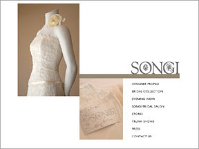
 Ad #1 - Songi - This ad has such a sleek, simple design. I love the position of the two photos and the line which 'grounds' the title and separates it from the 'journaling' (perfect for list style journaling).
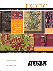 Ad #2 - Imaz Wholesale Imports - Not only am I intrigued by the block design of this ad, I am also drawn to the colors...the deep red, browns, greens and harvest orange. A great combination for a fall layout. It also reminds me that detail photography can be quite dynamic. How about taking some close-ups of your favorite things and create a layout around them.
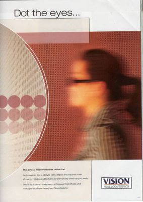 Ad #3 - Vision Wallcoverings - Not all photos must be 'perfect' in order to scrap them. How about a photo like this of yourself to use on a layout about how busy your life is? How about a photo like this of your child(ren) to use on a layout about how quickly they are growing up?
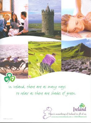 Ad #4 - Ireland - This layout inspires me with its design, colors and its shapes. The 'waves' cut into the photos would be perfect for a pool or beach layout.
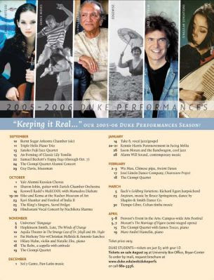 Ad #5 - Duke Performances - This ad is perfect inspiration for the journalistic scrapper's out there...there is plenty of room to record your memories. I envision a layout where the photos at the top are those of you family or friends. The area at the bottom is perfect for recording your memories and/or unique details about each one.
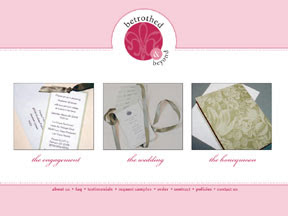 Ad#6 - Betrothed - LOVE the layout of this ad. The circular cut-out at the top is the perfect contrast to the square photos. Also love the color combination here - pink, fuchsia, sage green.
 Ad #7 - George Fox University - Have a dynamic photo? Enlarge it so that it spans the width (or length) of your layout like it does in this ad. I also love the title treatment in this ad...the large title that overlaps the photos. As far as design, if I were to scraplift this layout (and I just might!), I would move the journaling block to the bottom right and the emblem (my embellishment) to the top right to create (I think) a more effective visual triangle.
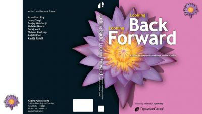 Ad #8 - Publication Council - How about stealing a title? I liked this one..."Looking Back, Looking Forward." This would certainly be a GREAT title for a self-reflection layout. Or, if you find 'all about me' layouts difficult, you could use it for a layout looking back on your child's life and what you hope for them as you look forward.
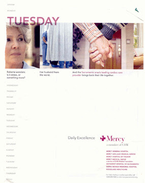 Ad #9 - Mercy - This layout reminds me that I need to scrap more about my daily life...like what do I do on an average Tuesday (again, stealing the title). Add a few photos that you take to showcase your day. And what about that list-like text along the left hand side? I think it's perfect for a timeline: 5:20 a.m. - Husband's alarm goes off, he continually hits snooze. 5:40 a.m. - Husband finally gets up. Go back to sleep. 6:45 a.m. - Shower 7:15 a.m. - Wait Kaitlin up....)
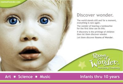 Ad #10 - Rooms of Wonder - Inspired by the photo...love the innocence. Like the color combination of the pink and green as well as the wave on the bottom right and top left.
Here's one I've done:
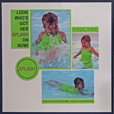 I'm willing to bet that you recognize the ad that this design idea was lifted from. The title, photo placement, captions and circle embellishment were all inspired by a Hanes ad (this particular one featured Kevin Bacon...so was just nice to look at!)
YOUR CHALLENGE?
#1 - Leave a comment here. Tell us which one is your favorite ad from above and why.
#2 - Create a scrapbook layout using one of the ads above as your inspiration. Remember to leave us a link!